Sparacino Realty Advisors
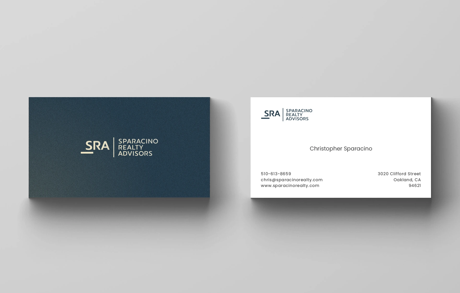
Christopher, the founder of SRA, a full-service commercial real estate advisory specializing in multifamily properties in the Eastern San Francisco Bay Area, sought a distinctive brand identity. Departing from the common rooftop imagery used by competitors, a simple wordmark was chosen to reflect SRA's unique approach.

SRA, short for Sparacino Realty Advisors, showcases its strong foundation through the bold line beneath the "S." The customized typeface, with its distinctive "R," reinforces the firm's commitment to a clean, professional image.


Client Feedback
I hired Adi to design a logo and he delivered a clean and modern design everything I was looking for. The project was completed efficiently and Adi was a pleasure to work with.
— Christopher Sparacino