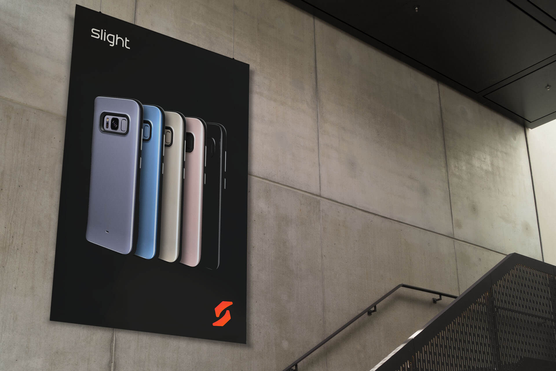
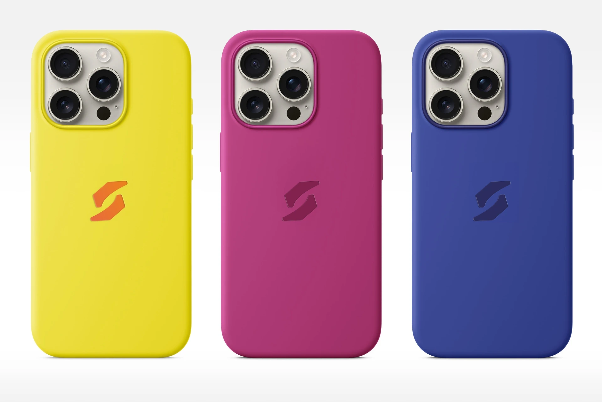
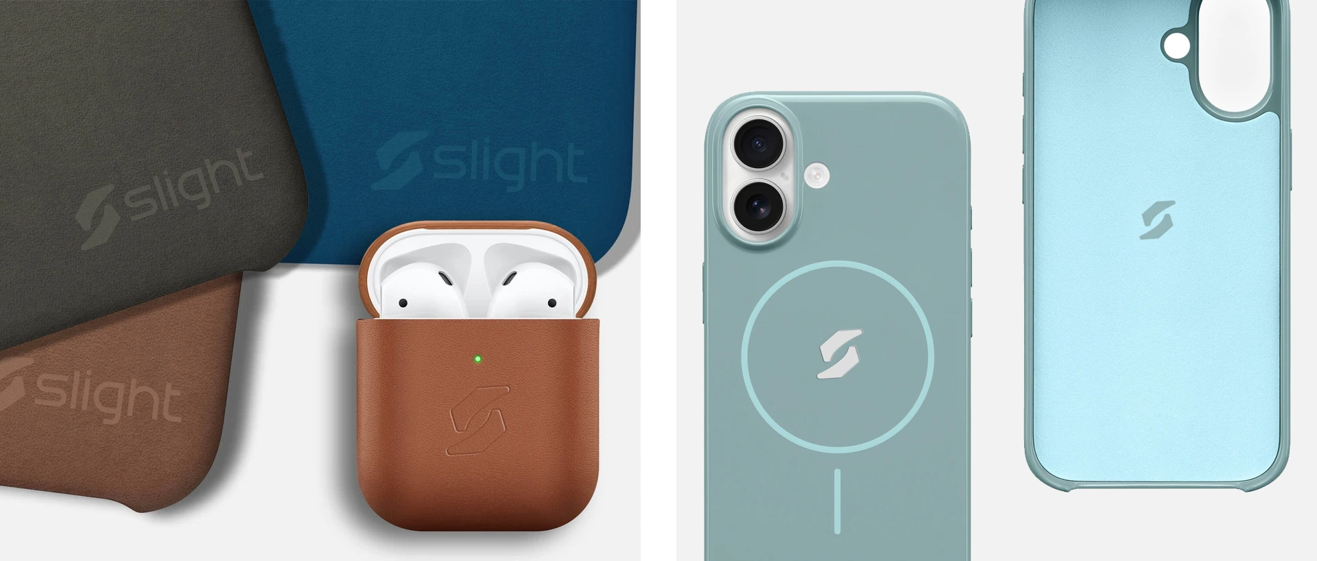
Slight Case
Slight Case, a nascent Canadian company, was poised to enter the smartphone case market. They possessed an internally developed logo resembling a boomerang that required refinement to enhance its visual appeal. My role was to revitalize the logo while preserving its core identity.
The existing logo exhibited a forward-leaning slant, which compromised its stability when used independently or in conjunction with the wordmark. The refinement process involved rectifying this issue to achieve a more rigid and balanced design. The central portion was enlarged, and the wordmark was optimized for legibility when embossed on leather or printed on plastic cases.
Client Feedback
I would highly recommend Adi as he is very experienced in design guidance, extremely responsive and provided quality work that's really worth the price we spent.
— Lawrence Palsis