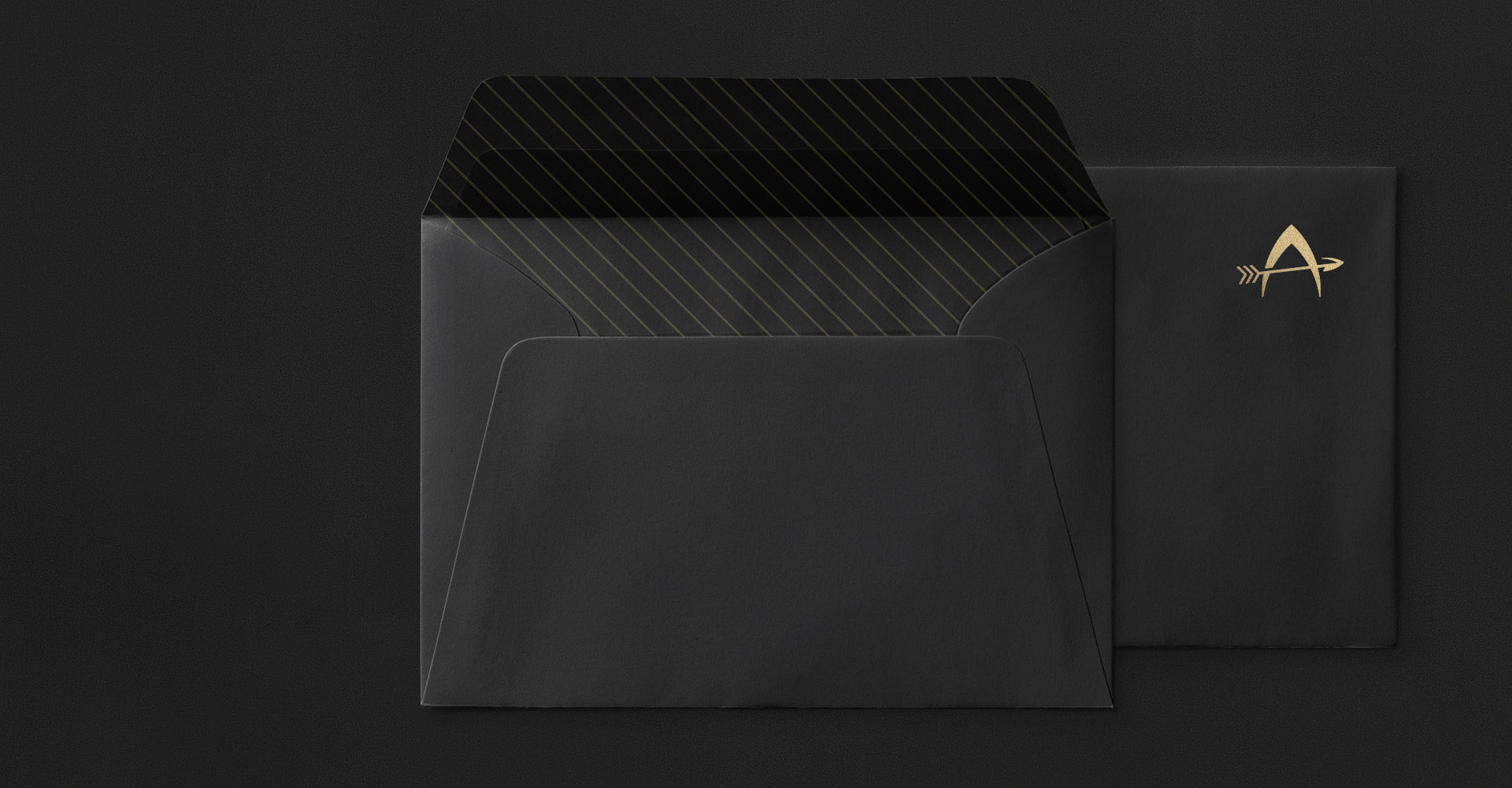
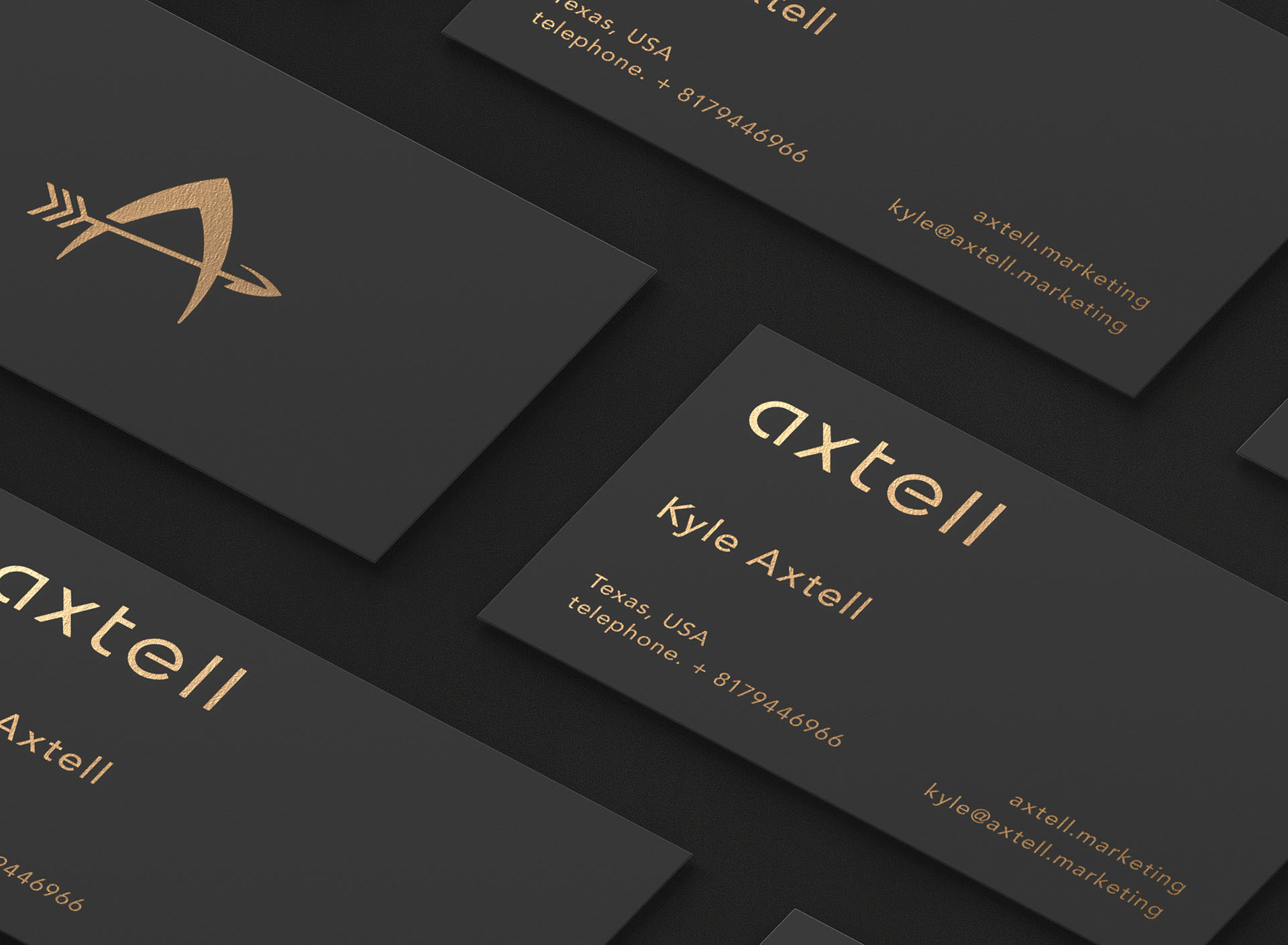
Axtell Marketing
Kyle contacted me in hope to get a simplistic refinement for the old logo of his independent marketing service. I was asked to give attention to the text and the logo mark to make them more pleasant to the eyes.

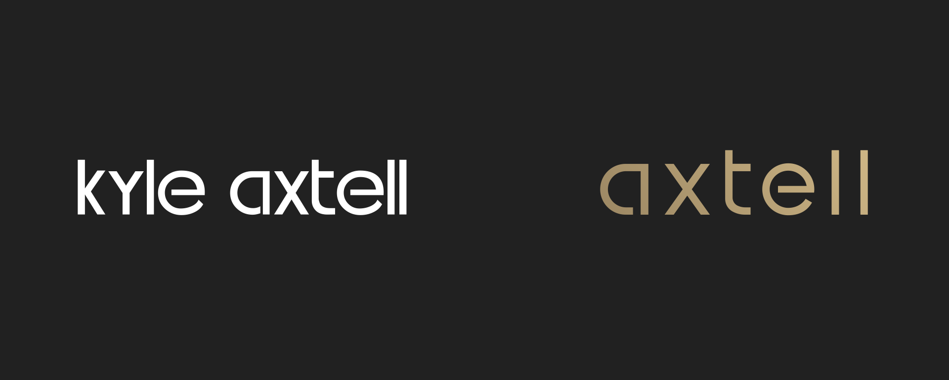
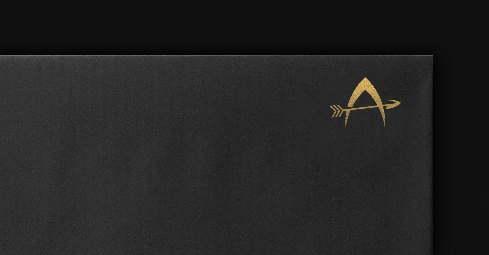
The old logo was obviously needed a further refinement to make it more professional. It had unnecessary color separation, looked too narrow and the wordmark felt crowded with inconsistent width on each letter. The company name was shortened to make it more memorable and a touch of gold on dark for brand assets was chosen to add elegancy.
Client Feedback
The final product was very clean and better than I could have expected. His work is well worth the price, highly recommend for anyone looking for a logo that needs to be taken seriously.
— Kyle Axtell